What's New in Eleven
The investor experience, redefined.
Radically simpler. Beautifully clear. We rethought every screen your investors touch, so private investing feels effortless without losing any of the depth your firm relies on. The light and dark switch above is live: this page is styled in the redesign itself.
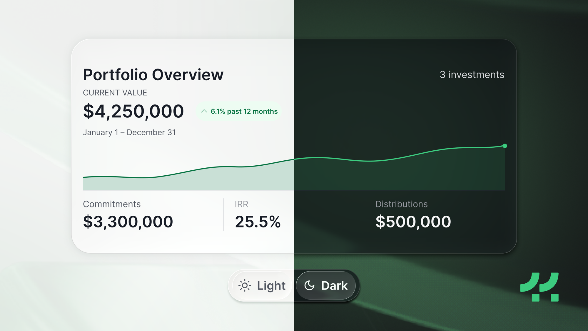
The same dashboard in both modes, and the switch above is the one your investors get.
What's new
Nine things your investors will notice
A cleaner, faster experience for the people you serve, on every device.
Navigation, reconsidered
A whole layer of the portal is gone. The old Dashboard, Library, and My Investments now live in Home, Documents, and the main navigation, so in a single-firm portal there is no separate place to hunt through.
Every investment, one click away
Your investors click straight into any investment from a single list. No more digging three or four levels deep, and no separate "My Investments" buried inside each portal.
All the power, none of the clutter
Nothing your investors rely on is going away. Every capability is still here, now bundled into something far simpler, and genuinely enjoyable to use.
A Home that adapts to each investor
The dashboard, navigation, actions, and to-dos reshape around each person's relationships, permissions, and investments, surfacing what needs attention first.
One place for every document
Offering materials, investment documents, reports, and data room content in a single view. No more wondering where something lives.
Clarity you can see
A calmer, lighter interface, with layered glass, refined type, and thoughtful motion, in two fully designed modes: light and dark.
Your brand, front and center
Redundant chrome removed so your firm's identity leads. On white-label portals, the whole interface adopts your color.
Workspaces
For investors with relationships across multiple firms: one login, one profile, and a single move between an aggregated portfolio and each individual firm.
Built for phones
Rebuilt responsive from the core, so reviewing documents, onboarding, or even signing a subscription feels natural on any screen.
See it
The redesign, on screen
A first look at what your investors get.
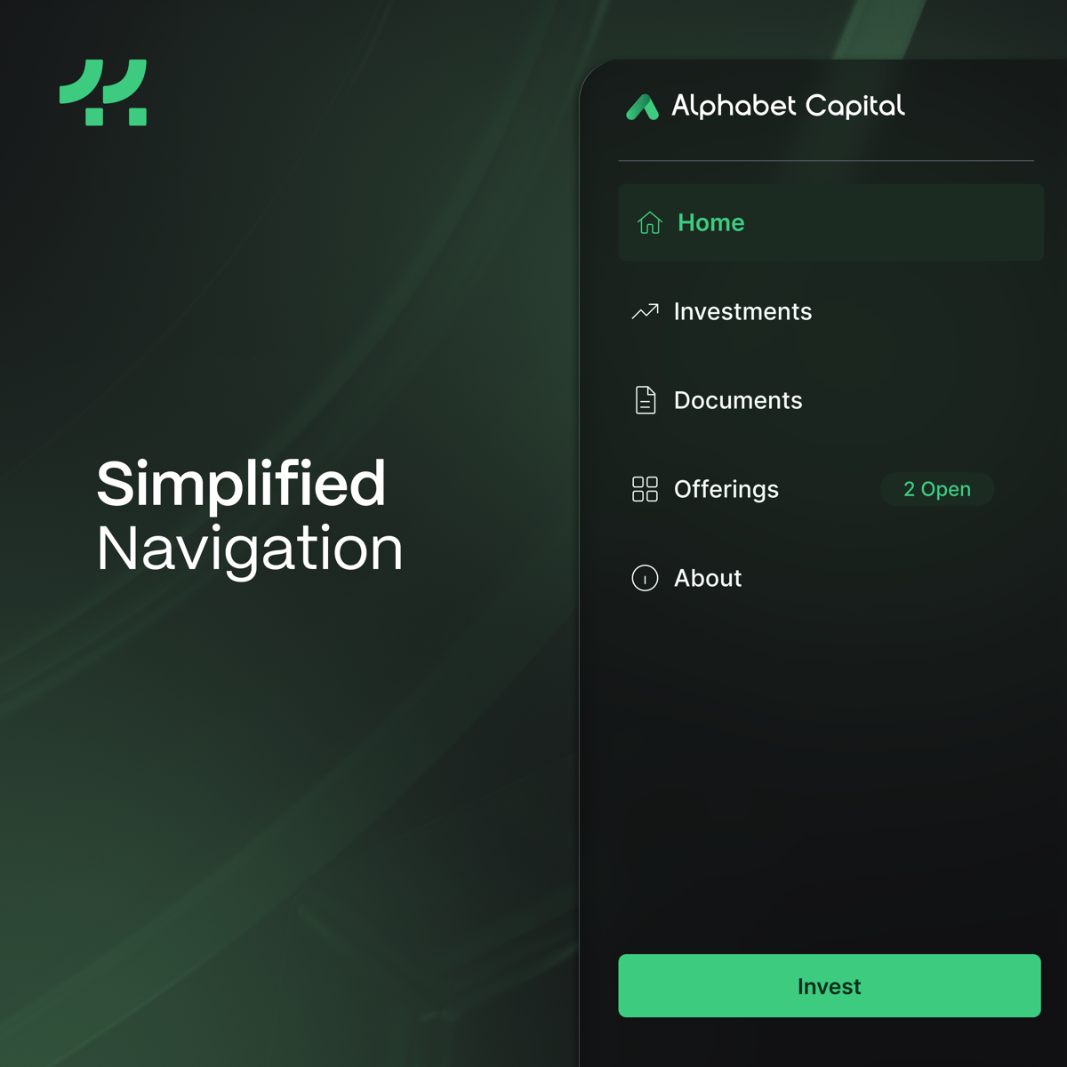
The portal question, answered
Investors used to ask what the portal even was and whether they needed to go there. Now there is no separate place to go, as the whole experience lives in one navigation. A layer of the app is gone, while delivering the full experience.
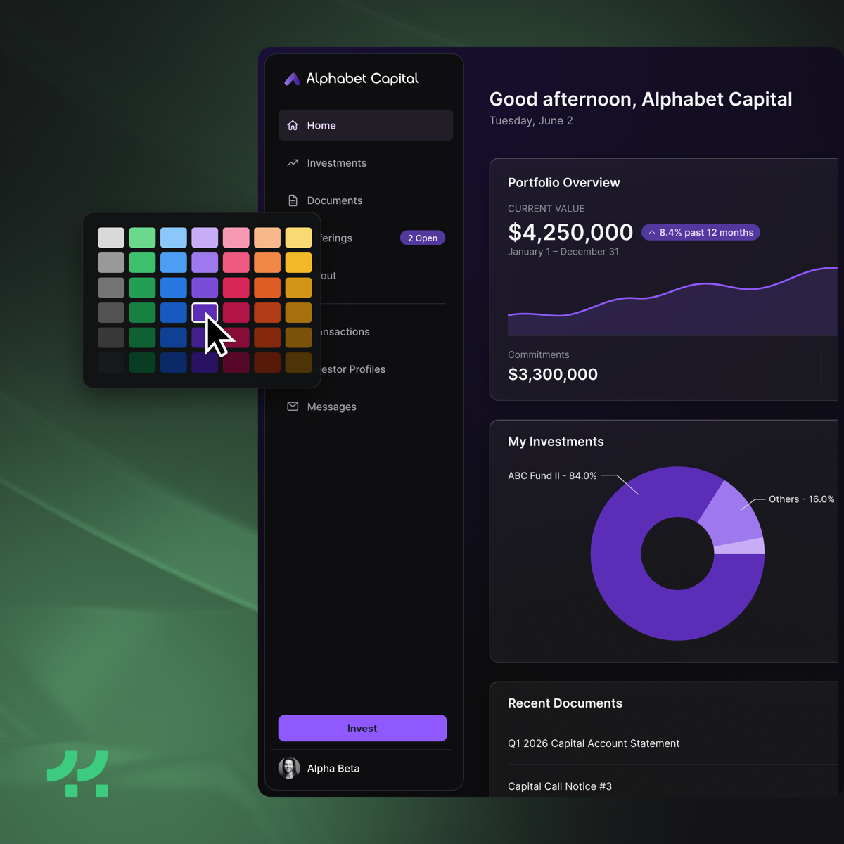
Unmistakably yours
We stripped redundant chrome so your firm's identity leads. On white-label portals the navigation, buttons, and charts adopt your color automatically, for a cleaner, more premium experience that feels like your own.
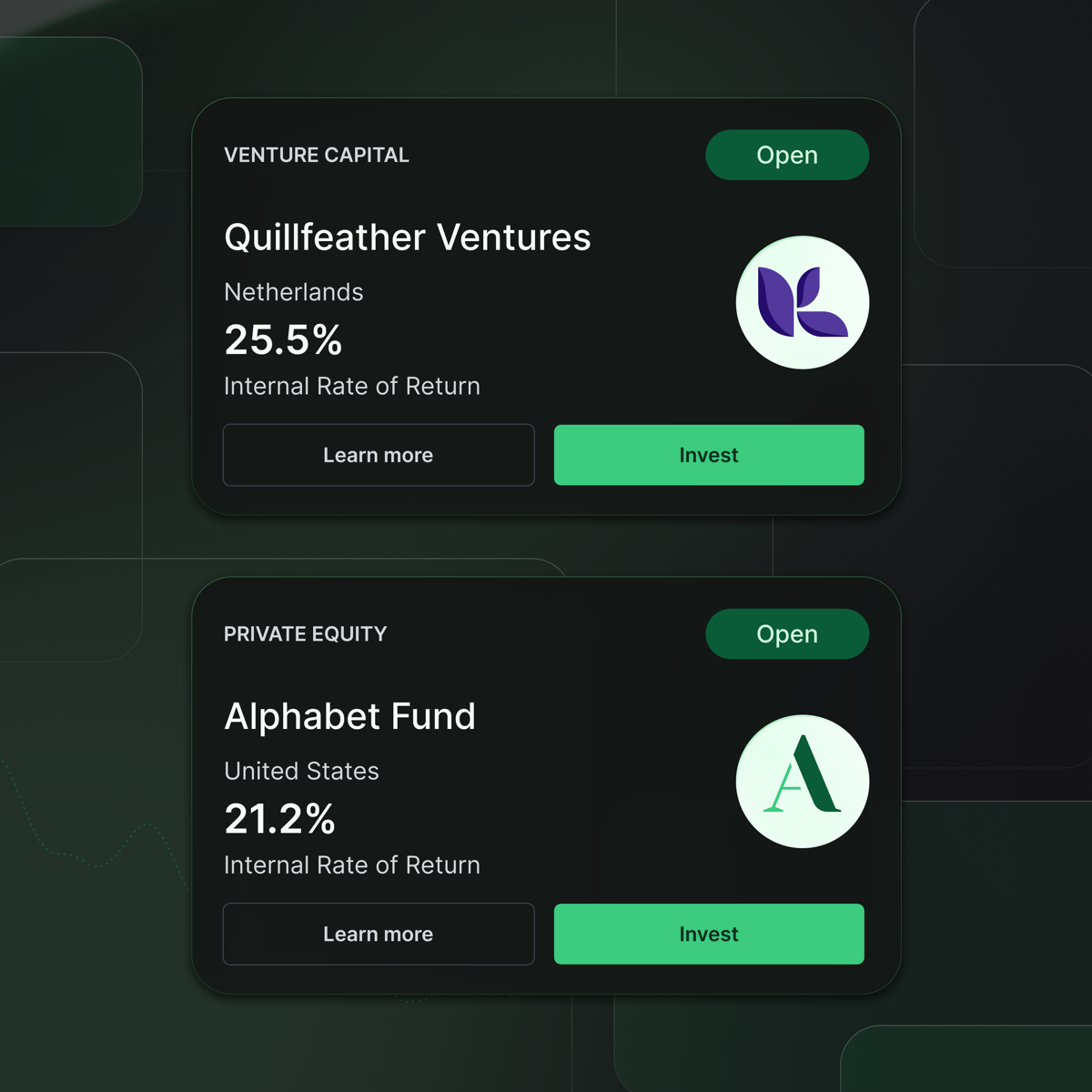
Investable opportunities
Open offerings surface right where investors already are, and the invest action is always one click away.
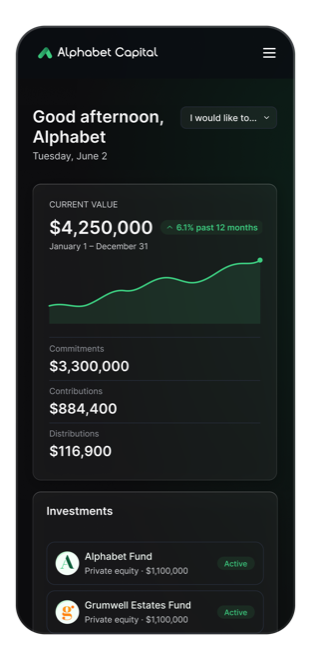
The whole experience, in a pocket
Every screen was rebuilt responsive, from the dashboard to documents to onboarding and every wizard. Investors can review and sign a subscription agreement without leaving their phone.
The full list
Everything that changed
The complete picture, by area.
Navigation
- One primary navigation replaces the separate portal menu.
- Dashboard is now Home, tailored to each investor.
- My Investments is now Investments, one click in and surfaced on Home.
- Library is now Documents, one home for every file.
- Company is now About, Transact is now Invest, and Voting moved into Settings.
- Your account moved to the foot of the navigation, with Settings inside it, and Company and Users there too for firm members.
- A scope switcher moves between Personal, All Portals, and each firm.
- Entering a firm keeps its pages pinned in the nav.
- Live badges and a green open dot mark open offerings, with an Open or All filter, and action items surface what needs attention.
Home
- A portfolio overview chart, in your brand color.
- A new percent-funded ring on the value tile.
- My Investments and a live To-Do, side by side.
- A Current Offerings tile for open opportunities.
- Pending votes now surface as action items.
Investments
- One filterable list of every investment.
- One click into a full investment detail page.
- Filters and deep links by firm, investor, and offering.
- A new toggle to roll holdings up by offering or see them all in a list.
- Per-currency totals across the whole filtered list.
- Select investments and export.
- Detail pages branded per firm.
- Offerings and investments now share one set of pages and one set of tabs, so an investment opens the same way whether you arrived from a client, from a portal, or from a link in an email.
Documents
- The Library of the Investor Portal now lives in a global documents area.
- Investors have single access to investment and data room documents, no matter the source.
- For fund admins and managers, the Library was renamed Data Room and lives as a separate administrative area.
- Switch between Investment and Data Room documents with one simple toggle, with no separate folder sidebar.
- Read any set as a single filterable list, or drill into its folders with a breadcrumb. Data rooms open in the folder view.
Transactions
- Clearer, color-coded statuses.
- A cleaner toolbar that works on phones.
- A summary that opens when you want it.
- A cleaner Invest page, surfacing items needing your attention.
Mobile
- Every screen your investors touch, rebuilt to work on phones and tablets.
- Onboarding, documents, and wizards all responsive.
- Review and sign a subscription on a phone, with a fit-to-width document and pinch to zoom.
- Settings and security tuned for small screens.
Visual and accessibility
- A refreshed interface in both light and dark modes.
- Improved contrast, readability, and accessibility throughout.
- Your brand color carried across navigation, buttons, and charts.
Managers and fund admins
- Admins see the same clean portal their investors do.
- A portal Home that aggregates across every investment.
- Your portal's pages stay pinned in the nav, with any investor-hidden tabs shown dimmed as a preview of what investors see.
- Edit and View on every portal page, Documents included, so you can review a page broadly as an investor will see it.
- For fund administrators, a client's portal opens as its own column beside your workspace, carrying that client's name and branding, so it is always clear whose pages you are working in.
- A manager's own portal works the other way: its pages are listed in the one main menu, so there is no second place to go.
Data rooms
- The Library is now the Data Room: a place to share material with prospects and other relationships, separate from the investment documents that always reach the investors they belong to.
- Access is granted per library, on each person's own record, and read-only access now looks read-only instead of offering controls that cannot apply.
- A clear warning when your data room is not reaching investors at all, and a setting that says which half of Documents it controls.
- Where an NDA is required, nothing about the material is exposed until it is accepted, down to file and folder names.
- Renaming or deleting a library tells you what is attached to it first.
Built to make private investing feel effortless.
For your investors, and for your team. It is the same idea that drives Eleven: simplify complexity, without sacrificing capability.